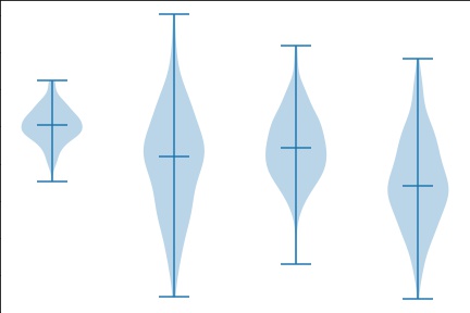
A Violin plot is similar to Box plot, with the addition of a rotated kernel density plot on each side. A Violin plot is an abstract representation of the probability distribution of the sample. violin plots use kernel density estimation (KDE) to compute an empirical distribution of the sample.
A Violin plot is more informative than a Box plot. A Box plot only serves summary statistics such as mean/median and interquartile ranges, whereas the violin plot shows a deeper understanding of the density.
A Axes.violinplot method used to make a violin plot.
Parameters:
- dataset : the input data
- positions : Sets the positions of the violins.
- vert : bool(Default-True)
-
- If true, creates a vertical violin plot. Otherwise, creates a horizontal violin plot.
-
- widths : width of each violin.
- showmeans : bool(Default-False)
-
- If True, will toggle rendering of the means.
-
- showextrema : bool(Default-True)
-
- If True, will toggle rendering of the extrema.
-
- showmedians : bool(default – False)
-
- If True, will toggle rendering of the medians.
-
- points : Defines the number of points to evaluate each of the Gaussian kernel density estimations at.
- bw_method : The method used to calculate the estimator bandwidth.
Example :
import matplotlib.pyplot as plt
import numpy as np
np.random.seed(10)

collectn_1 = np.random.normal(100, 10, 200)
collectn_2 = np.random.normal(80, 30, 200)
collectn_3 = np.random.normal(90, 20, 200)
collectn_4 = np.random.normal(70, 25, 200)
data_to_plot = [collectn_1, collectn_2, collectn_3, collectn_4]

fig = plt.figure()
ax = fig.add_axes([0,0,1,1])
bp = ax.violinplot(data_to_plot,showmedians=True)
plt.show()
This produces the following result:

. . .