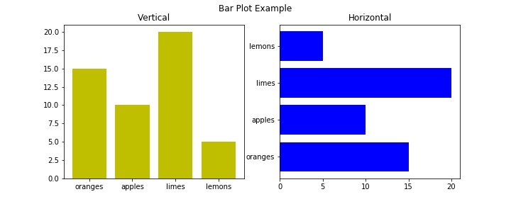
The Bar graph is a graphical representation of the categorical data with rectangular bars with heights proportional to the values that they present. The Bar graph can be a horizontal or vertical representation. In Bar plot, one axis represents the categories and another axis represents the measured value in each category.
This tutorial explained the different bar graph such as vertical bar plot, horizontal bar plot, stacked bar plot and group bar plot with example.
. . .
Vertical Bar graph : The pyplot.bar method used to draw a bar plot of categorical data.
Parameters:
- x : sequence of scalars
- height : The height of the bars.
- width : The width of the bars.
- bottom : The y coordinate(s) of the bars bases
Horizontal Bar Graph : The pyplot.barh method makes a horizontal bar plot of categorical data.
Parameters:
- y : The y coordinates of the bars.
- width : The width of the bar
- height : The height of the bar
- left : The x coordinates of the left sides of the bars (default: 0).
Example:
import matplotlib.pyplot as plt
data = {'apples': 10, 'oranges': 15, 'lemons': 5, 'limes': 20}
names = list(data.keys())
values = list(data.values())

fig = plt.figure(figsize=(10,4))
fig.suptitle("Bar Plot Example")

fig.add_subplot(1,2,1)
plt.bar(names,values,color='y')
plt.title("Vertical")

fig.add_subplot(1,2,2)
plt.barh(names,values,color='b')
plt.title("Horizontal")
plt.show()
This produces the following graph:

. . .
Stacked Bar Graph
import matplotlib.pyplot as plt

edu_level = ['primary','secondary','higher secondary','graduate','post farduate']
men = [50,65,43,96,36]
female = [70,88,66,74,100]

fig = plt.figure(figsize=(8,5))
p1 = plt.bar(edu_level,men,width=0.4)
p2 = plt.bar(edu_level,female,bottom=men,width=0.4)

plt.title("Number of student in each education level by gender")
plt.xlabel("Education level")
plt.ylabel("Number of student")
plt.legend((p1[0],p2[0]),('Men','Female'))
plt.show()
This produces the following result:

. . .
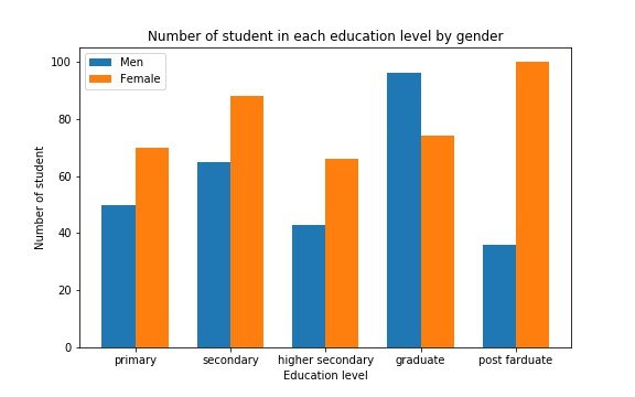
Group Bar Graph
import matplotlib.pyplot as plt
import numpy as np

edu_level = ['primary','secondary','higher secondary','graduate','post farduate']
men = [50,65,43,96,36]
female = [70,88,66,74,100]
index = np.arange(len(edu_level))
width = 0.35

fig = plt.figure(figsize=(8,5))
p1 = plt.bar(index,men,width=width,label="Men")
p2 = plt.bar(index+width,female,width=width,label="Female")

plt.title("Number of student in each education level by gender")
plt.xlabel("Education level")
plt.ylabel("Number of student")
plt.xticks(index+width/ 2,edu_level)
plt.legend()
plt.show()
This produces the following result:

. . .