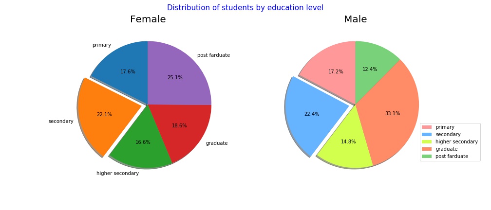
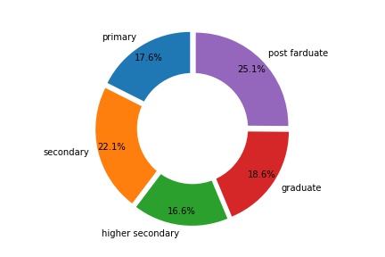
A Pie chart is a circular statistical graphic representation, which is divided into slices to demonstrated the numerical proportion. A Matplotlib package provides several methods to draw a different pie chart with beautiful representation. This tutorial illustrated various methods of a pie chart with examples.
A pyplot.pie method used to draw a pie chart of categorical data.
Parameters:
- x : The wedge sizes.
- explode : Optinal. Default-None
-
- If not None, is a
len(x)array which specifies the fraction of the radius with which to offset each wedge.
- If not None, is a
-
- labels : list of labels for each wedge.
- color : color of pie chart
- shadow : Draw a shadow beneath the pie.
- radius : The radius of the pie, if radius is None it will be set to 1.
- counterclock : bool(Default-True). specify the direction
- startangle : angle to start of pie chart
Example:
import matplotlib.pyplot as plt

edu_level = ['primary','secondary','higher secondary','graduate','post farduate']
female_student = [70,88,66,74,100]
men_student = [50,65,43,96,36]

explode = (0, 0.1, 0, 0,0)  # only "explode" the 2nd slice (i.e. 'secondary')
colors = ['#ff9999','#66b3ff','#d2ff4d','#ff8c66','#79d279']
fig1, ax1 = plt.subplots(1,2, figsize=(14,6))
fig1.suptitle("Distribution of students by education level",fontsize=15,color="B")

ax1[0].pie(female_student, explode=explode, labels=edu_level, autopct='%1.1f%%',shadow=True, startangle=90)
ax1[0].axis('equal')  # Equal aspect ratio ensures that pie is drawn as a circle.
ax1[0].set_title("Female", fontsize=20)

ax1[1].pie(men_student, explode=explode, autopct='%1.1f%%',colors=colors,shadow=True, startangle=90)
ax1[1].axis('equal')  # Equal aspect ratio ensures that pie is drawn as a circle.
ax1[1].set_title("Male",fontsize=20)
plt.legend(edu_level,loc=0,bbox_to_anchor=(0.5, 0., 0.8, 0.4))
plt.show()
This draws the following graph:

. . .
import matplotlib.pyplot as plt
import numpy as np

edu_level = ['primary','secondary','higher secondary','graduate','post farduate']
female_student = [70,88,66,74,100]
men_student = [50,65,43,96,36]

explode = (0.05,0.05,0.05,0.05,0.05)
plt.pie(female_student, labels=edu_level, autopct='%1.1f%%', startangle=90, pctdistance=0.85, explode = explode)
#draw circle
centre_circle = plt.Circle((0,0),0.60,fc='white')
fig = plt.gcf()
fig.gca().add_artist(centre_circle)
plt.tight_layout()
plt.show()
. . .
import matplotlib.pyplot as plt
import numpy as np

edu_level = ['primary','secondary','higher secondary','graduate','post farduate']
gender_level = ['Male','Female']
vals = np.array([[70, 50], [88, 65], [66, 43],[74,96],[100,36]])

explode = (0.2,0.2,0.2,0.2,0.2)
explode_gender = (0.1,0.1,0.1,0.1,0.1,0.1,0.1,0.1,0.1,0.1)
colors_gender = ['#c2c2f0','#ffb3e6']
size = 0.3

fig, ax = plt.subplots(2,2,figsize=(12,9))
cmap = plt.get_cmap("tab20c")
outer_colors = cmap(np.arange(5)*4)
inner_colors = cmap(np.array([1, 2, 5, 6, 9, 10,13,14,17,18]))

ax[0,0].pie(vals.sum(axis=1), radius=1, colors=outer_colors, labels=edu_level, wedgeprops=dict(width=size, edgecolor='w'))
ax[0,0].pie(vals.flatten(), radius=1-size, colors=inner_colors)

ax[0,1].pie(vals.sum(axis=1), radius=1, colors=outer_colors,
       wedgeprops=dict(width=size, edgecolor='w'))
ax[0,1].pie(vals.flatten(), radius=1-size, colors=inner_colors,  wedgeprops=dict(width=size, edgecolor='w'))

ax[1,0].pie(vals.sum(axis=1), radius=1, colors=outer_colors,explode=explode, wedgeprops=dict(width=0.8, edgecolor='w'))
ax[1,0].pie(vals.flatten(), radius=1-size, colors=inner_colors, explode=explode_gender,
          wedgeprops=dict(width=0.8, edgecolor='w'))

ax[1,1].pie(vals.sum(axis=1), radius=1, colors=outer_colors,explode=explode,
       wedgeprops=dict(width=0.8, edgecolor='w'))
ax[1,1].pie(vals.flatten(), radius=1-size, colors=colors_gender, explode=explode_gender,
          wedgeprops=dict(width=0.2, edgecolor='w'))
plt.show()

. . .