The pyplot.scatter method draws a scatter plot of x and y data points. Generally, a scatter plot is used to observe the relationship between two variables. How one variable is changed with respect to change in the other variable. Fundamentally, the scatter plot works with 1-D arrays.
parameters:
- x,y : Data
- s : scalar or array_like. The marker size in points**2.
- c : sequence of color
- marker : The marker style
- cmap : Colormap
Example
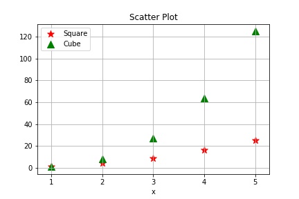
import matplotlib.pyplot as plt
x = [1,2,3,4,5]
y2 = [1,4,9,16,25]
y3 =[1,8,27,64,125]

plt.scatter(x,y2, label='Square',color='r',marker='*',s=100)
plt.scatter(x,y3,label='Cube',color='g',marker='^',s = 100)
plt.xlabel('x')
plt.title('Scatter Plot')
plt.grid(True)
plt.legend()
plt.show()
#This draws the following graph:
import pandas as pd
import matplotlib.pyplot as plt

df = pd.read_csv("train.csv")

fig = plt.figure(figsize=(10,5))
plt.scatter(df['SalePrice'],df['GrLivArea'],c='g',marker='*',alpha=0.5,s = 200)
plt.scatter(df['SalePrice'],df['TotalBsmtSF'],c='r',marker='*',alpha=0.5,s = 200)
plt.xlabel('SalePrice')
plt.legend()
This draws the following graph:

. . .