Pandas also provides visualization functionality. It uses Matplotlib library for plotting various graph. This tutorial has demonstrated various graph with examples.
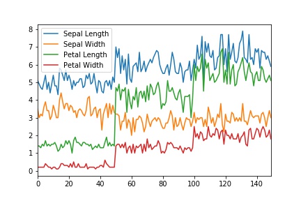
Line Plot
from sklearn import datasets
import pandas as pd
iris = datasets.load_iris()
iris_df = pd.DataFrame(iris.data,columns=['Sepal Length','Sepal Width', 'Petal Length', 'Petal Width'])
iris_df['target'] = iris.target
iris_df.plot()
. . .
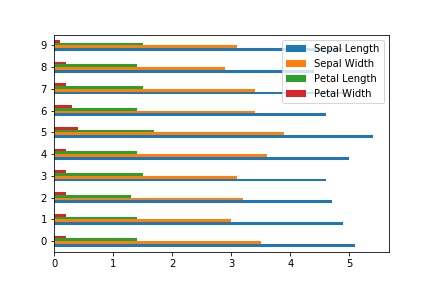
Bar Plot
A barplot can be drawn by using the plot.bar() & plot.barh() methods.
In [1]: df[:10].plot.bar(stacked=True)In [2]: df[:10].plot.barh()
. . .
Histograms
Histograms can be drawn by using the plot.hist() methods. The df.hist() plots the histograms of the columns on multiple subplots:
In [3]: df.plot.hist(alpha=0.7)In [4]: df.plot.hist(stacked=True, bins=20,orientation='horizontal')
In [5]: df.hist()

. . .
Box plots
Boxplot can be drawn calling plot.box() or boxplot() method to visualize the distribution of values within each column.
In [6]: df.plot.box()

. . .
Area plot
The plot.area() method used to draw the area plot. Area plots are stacked by default. When input data contain NaN, it will automatically filled by 0 because each column must be non-zero to produce stacked area plot.
In [7]: df.plot.area()

. . .
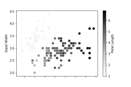
Scatter plot
Scatter plot can be drawn by using the plot.scatter() method. Scatter plot requires numeric columns for the x and y axes. These can be specified by the x and y keywords.
In [8]: ax = df.plot.scatter(x='Sepal Length',y='Sepal Width',label="Sepal",color='g') In [9]: df.plot.scatter(x='Petal Length',y='Petal Width',label="Petal",color='r',ax=ax)In [10]: df.plot.scatter(x='Sepal Length',y='Sepal Width',c='Petal Length',s=50)
. . .
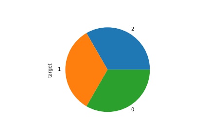
Pie plot
The plot.pie() method used to draw pie chart. If your data includes any NaN, they will be automatically filled with 0. A ValueError will be raised if there are any negative values in your data.
In [11]: iris_df['target'].value_counts().plot.pie()
. . .
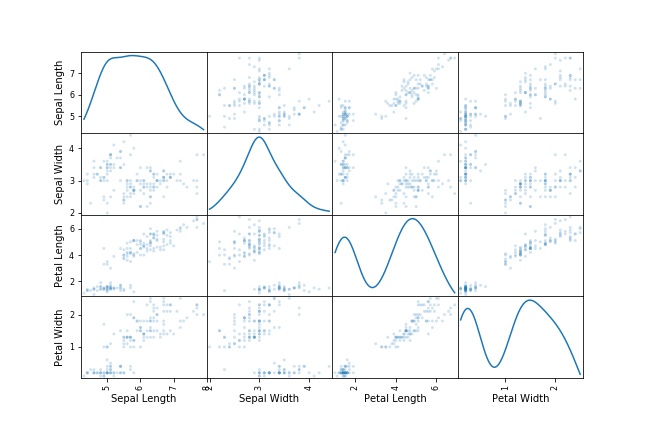
Scatter matrix plot
You can create a scatter plot matrix using the scatter_matrix method in pandas.plotting.
In [11]: from pandas.plotting import scatter_matrix
In [12]: scatter_matrix(iris_df, alpha=0.2, figsize=(9, 6), diagonal='kde')
. . .
Density plot
The plot.kde() method used to draw the density plot.
In [13]: iris_df.plot.kde()

. . .